Accessible PowerPoint and PDF Guide
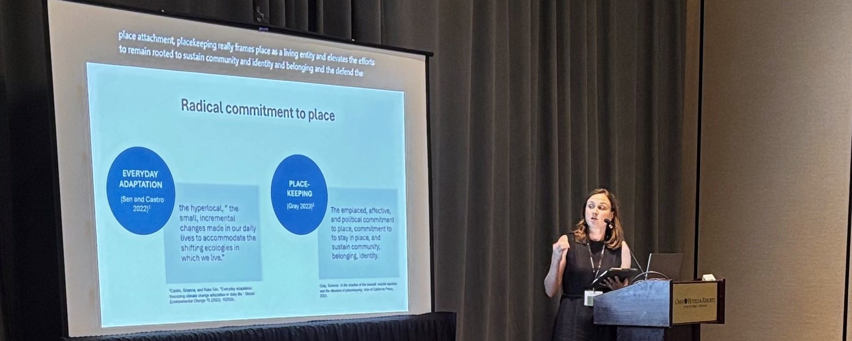 Photo from the 2025 Researchers Meeting, courtesy of Rosie Lin.
As a Workshop panelist or poster presenter, you will be asked to submit a digital PDF version of your presentation or poster for the Workshop website and online program. Take the following steps to ensure your PowerPoint and PDF are accessible to people with low-vision impairments or people using screen readers. For detailed guidance on these topics, please refer to the accessibility resources.
Accessible Text and Colors
Font. Use a simple and familiar typeface. Sans serif-fonts are often recommended for readability. Avoid bolding, italicizing, or capitalizing long sections of text.
Text size. Use a readable text size. For posters, see the rule of thumb for poster text sizes.
Colors. Using beautiful colors helps make your presentation or poster more interesting to look at. Choose high contrast colors that are accessible to readers with color-blindness or low vision impairments. Below are some general guidelines; see the resources section for details.
Contrast. Make sure you have sufficient contrast between background colors and text colors by using a contrast checker, such as WebAim’s Contrast Checker or Vispero’s Colour Contrast Analyser. In general, light backgrounds and dark texts are more readable.
Avoid relying only on color to convey meaning. If your presentation or poster has graphs, charts, maps, or other visuals which use color to explain something, you should provide that same information in another way. Options for doing so include annotating the image or adding styles or contrasts to further differentiate colors.
Accessible PowerPoints
Alt text. Provide alt text or detailed captions for figures and images. Alternative text should be concise, useful to the reader, and avoid redundant details. Decorative images do not usually need alternative text. Read WebAIM’s helpful alternative text guide for more information.
Define reading order. Blocks of text and other poster elements should be placed in order for screen readers.
Accessible PDFs
Make the source document accessible. Fixing accessibility issues in PDFs can be challenging. Before converting your presentation or poster to a PDF, use the source software’s accessibility checker. Use the tools in the source software to remediate any issues.
Save as PDF. To retain the accessibility features in your source document, save the document as a PDF. Do not print as PDF as doing so can lead to loss of the reading and slide order structure, alternative text, and other accessibility and design features.
Accessibility Resources
Accessibility Overviews
- Academic poster resources: Accessibility, by Yale Library
- Creating accessible materials for people with visual or auditory disabilities, by Mary Angelica Painter, Candace Evans, Melissa Villareal, and Carson MacPherson-Krutsky
- Introduction to web accessibility, by WebAIM
Understanding and Testing Color Contrast
- Contrast checker, by WebAIM
- Colour Contrast Analyser (CCA) App, by Vispero
- How to pick more beautiful colors for your data visualizations, by Lisa Charlotte Muth
Designing for People With Color Blindness
- Coloring for colorblindness, by David Nichols
- Designing for color blindness, by WebAIM
- Understanding color blindness: A guide to accessible design, by Crux Collaborative
- Coblis—Color blindness simulator, by Colblindor
Accessible PowerPoints and PDFs
- Alternative text, by WebAIM
- Accessible PowerPoints, by WebAIM
- Usability and digital accessibility: PDFs and documents, by Yale University
- Accessible PDFs, by WebAIM
- PDFs: Review and repair order, by WebAIM
Questions and Further Guidance
If you have questions about making your Natural Hazards Workshop presentation or poster accessible or comments about this guide, please email us at workshop@colorado.edu.